Chase Medical Logo Reveal
CLIENT
Chase Medical Limited
ROLE
Motion Design
ABOUT
Chase Medical is a UK based recruitment agency specializing in the primary care sector. The company connects healthcare professionals, including Nurse Practitioners, Practice Nurses, and General Practitioners, with opportunities across general practices, community settings, and social care environments.
The client wanted to expand their existing brand system through motion, creating a logo animation that could strengthen and elevate their marketing communication.
Unlike many competitors in the healthcare industry that rely heavily on traditional corporate blues and greens, Chase Medical embraces a warmer and more approachable tone. Their visual identity uses bright colors and human centered imagery to communicate energy, friendliness, and enthusiasm, qualities that reflect the brand’s personality and relationship with people.
CONCEPT
The existing brand identity already conveyed a strong sense of warmth, energy, and approachability through its color palette and photography. The goal of the animation was to bring those qualities to life while staying consistent with the established visual language.
After analyzing the client’s existing assets and gathering visual references, we decided to follow a more minimal and clean direction that complemented the brand identity.
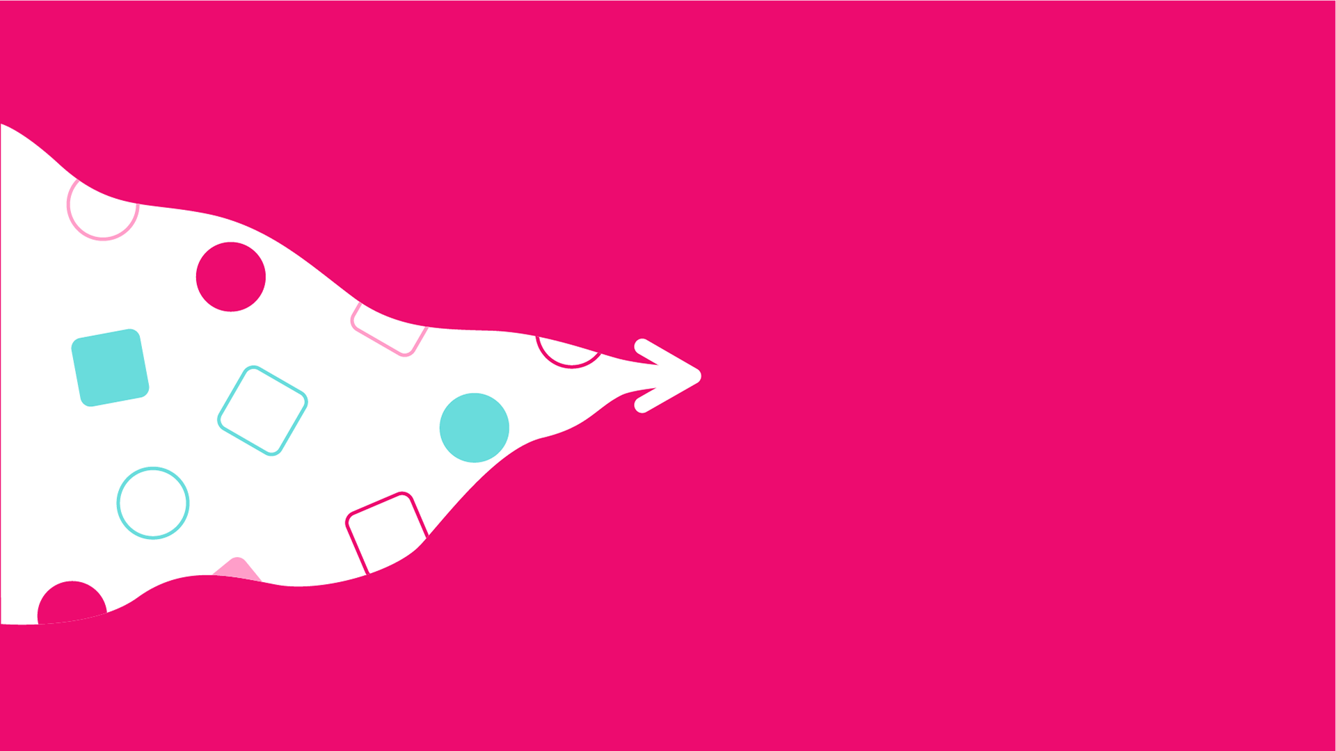
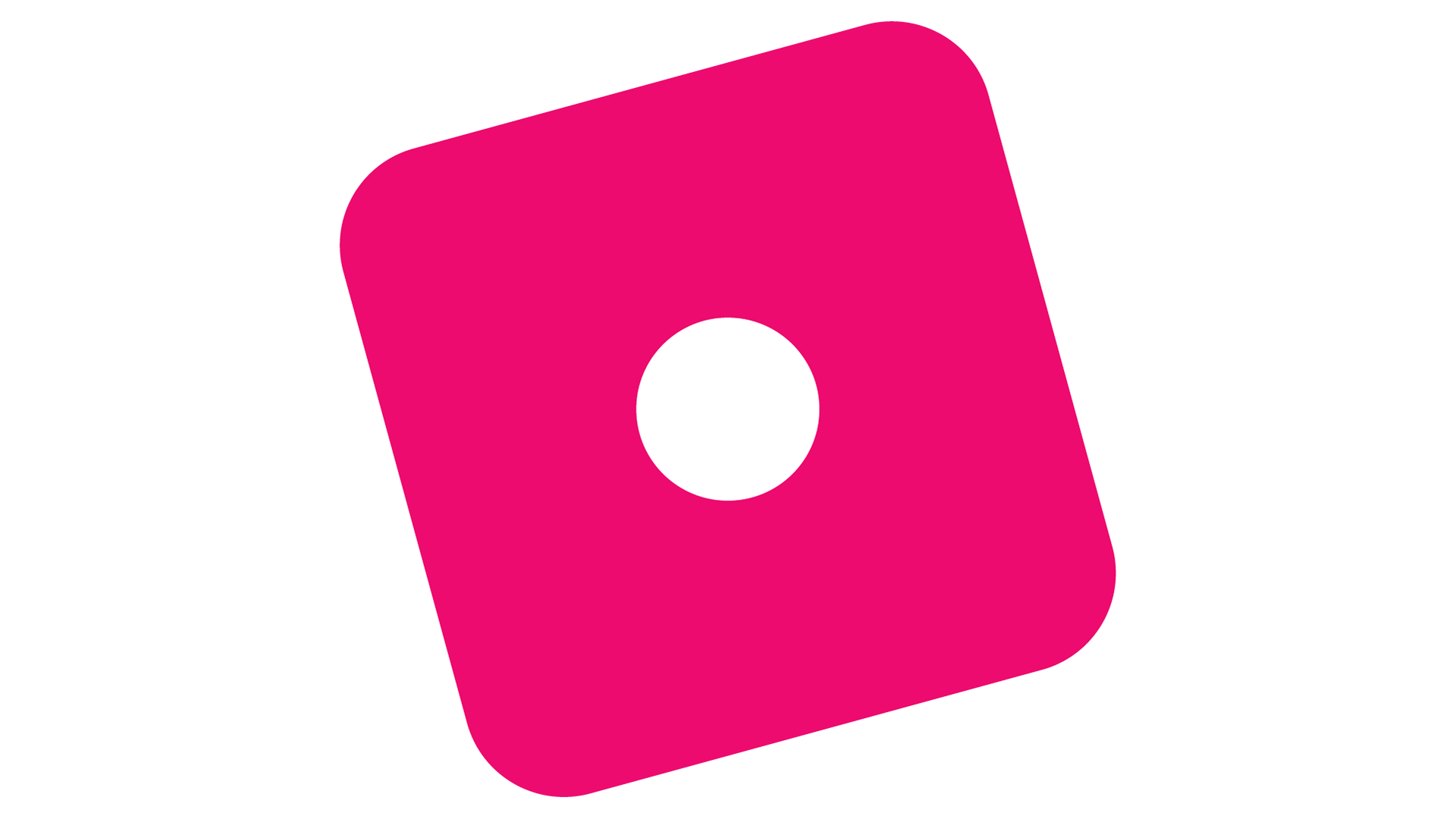
The logo itself suggested two key visual interpretations. The first was the checkmark, representing validation, approval, and the recruitment process. The second was the human figure, symbolizing people, the core of the business.
With that in mind, we designed a versatile intro animation that could be used across different touchpoints, including explainer videos, interviews, website content, and social media. The animation tells a playful story inspired by the recruitment journey.
STORYBOARD & RATIONALE
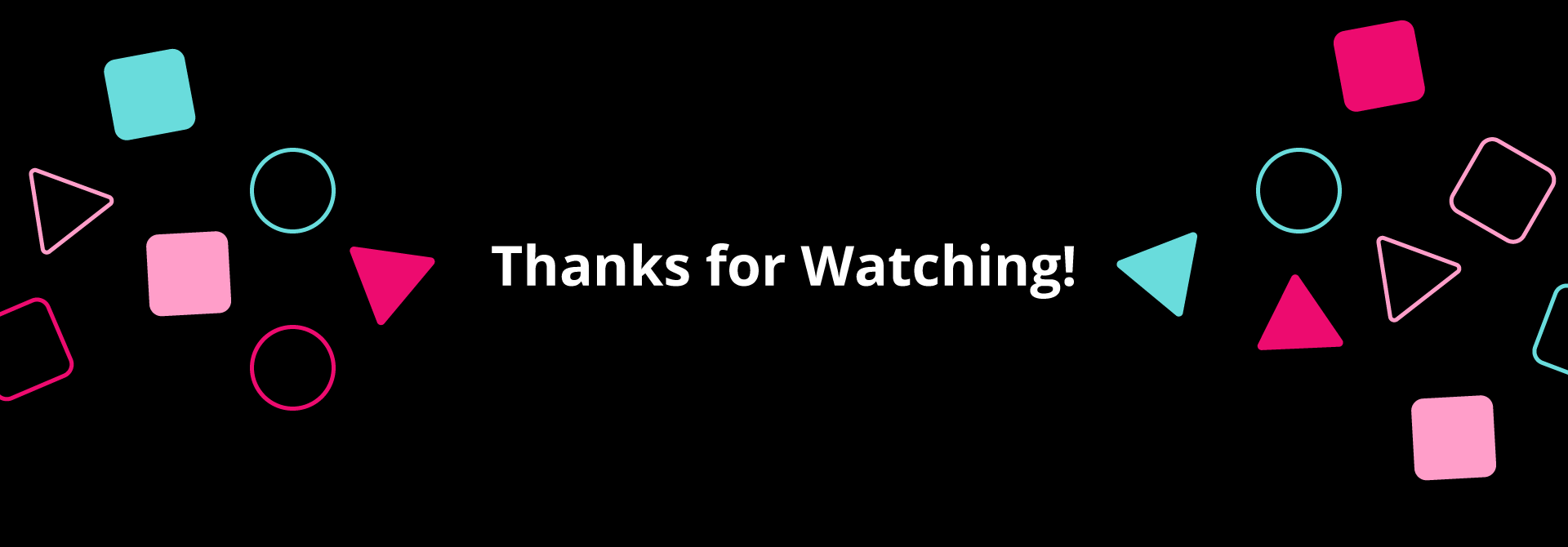
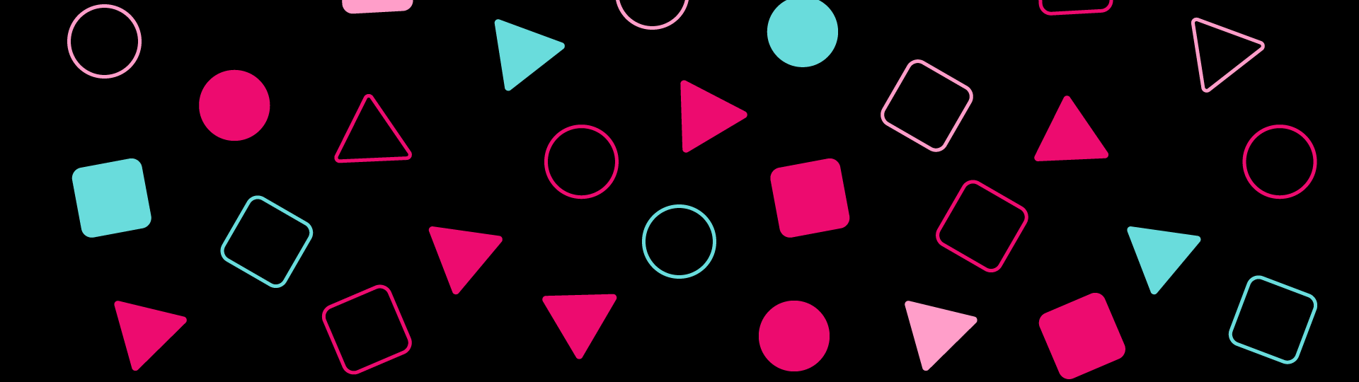
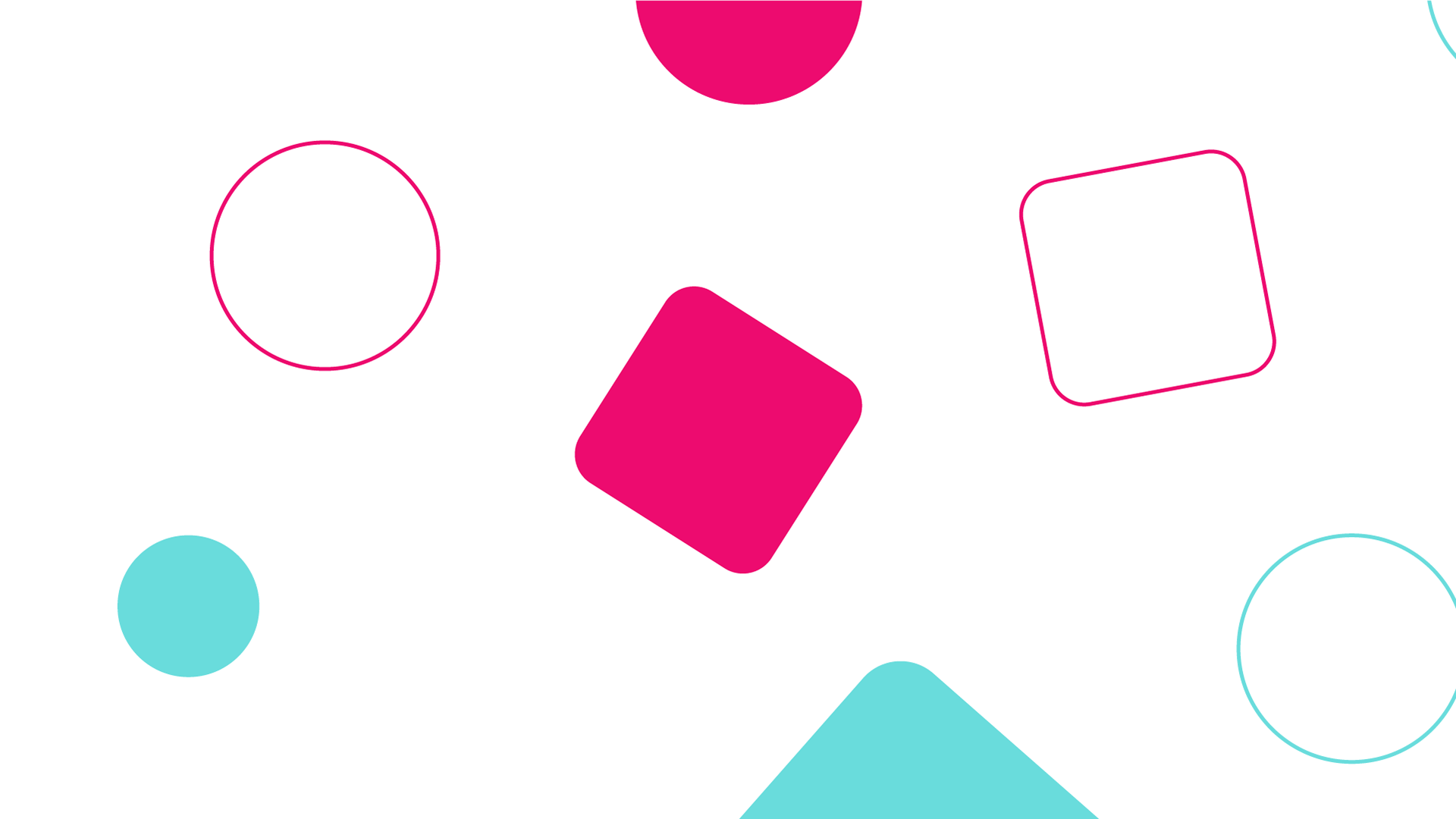
The story follows the recruiter guiding the hiring process, represented by an arrow that reveals a diverse pool of candidates. To keep the animation minimal, playful, and easy to understand, the candidates were represented through geometric shapes using different colors, fills, and strokes.
As the selection process progresses, the camera zooms into the chosen candidate, creating a dynamic transition into the logo reveal. Traditional animation principles such as squash and stretch and careful timing were used to give the motion a more organic and lively feel.
The overall pacing and movement were designed to reinforce the brand’s energetic and human centered personality while keeping the animation flexible enough to work across multiple formats and platforms.
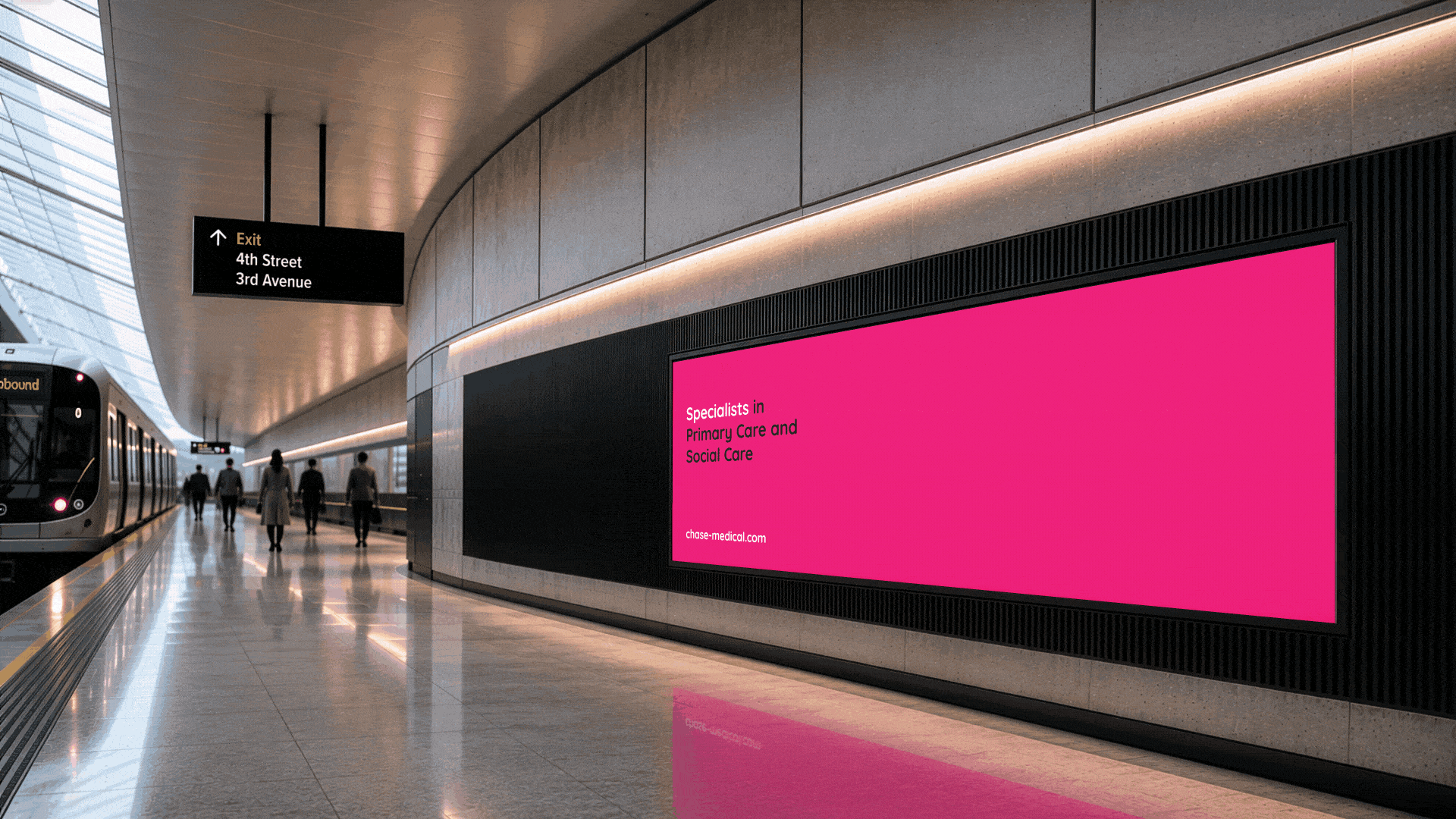
MOTION APPLICATION
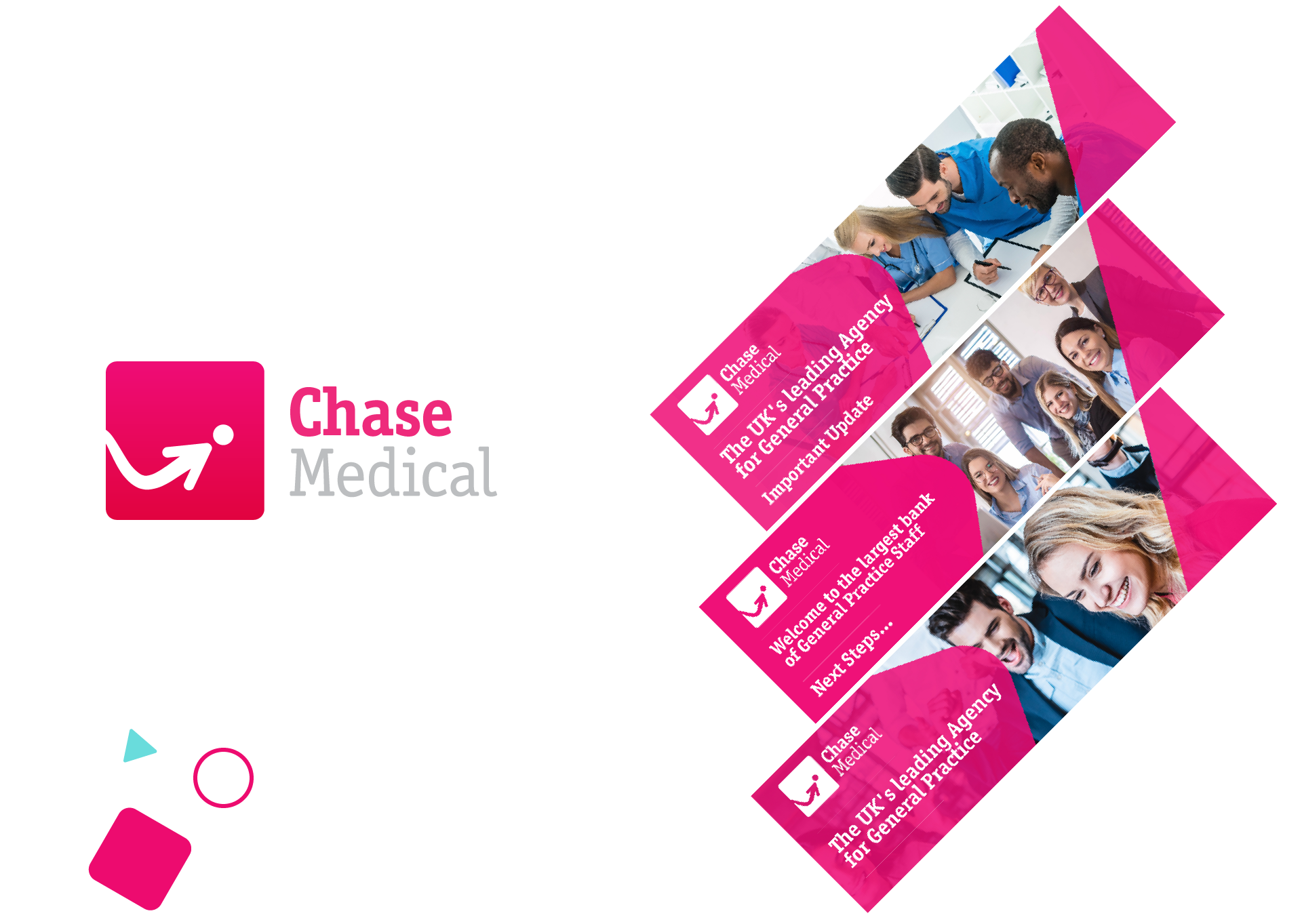
To demonstrate how the animation can be integrated into real-world communication, we explored its application in a digital transit display. The flexible nature of the animation allows it to be used across a variety of touchpoints, from public screens and websites to social media and video content.
Full Credits
Production: Superside
Creative Project Manager: Tamara Dalhuijsen
Creative Lead: Gabriella Bajkai
Design: Gabriela Rojas
Motion Design: Rodrigo Kormann
Creative Project Manager: Tamara Dalhuijsen
Creative Lead: Gabriella Bajkai
Design: Gabriela Rojas
Motion Design: Rodrigo Kormann