
Mkt Shake
Client
RD Station
Role
Direction + Design + Animation
About
While I was working at RD Station, the leading company in digital marketing in Brazil and South America, the Audio Visual (AV) team was creating hero content for our YouTube channel. The company believed that spreading knowledge to clients and the marketing community, in general, was the foundation of its success. Our YouTube channel was part of this strategy, and having quality content was one of our goals.
The AV team came up with the idea of creating a series of videos about marketing that would be released on our YouTube channel. The content would be informative and bring curiosities about this topic.
My role on this project was to create a pilot episode that would include the main title and an intro.
Idea
Our YouTube channel had live-action content. So, for this new content, the AV team came up with the idea of creating a series of videos that would be released in small drops of entertaining animated series.
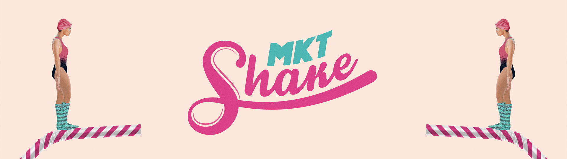
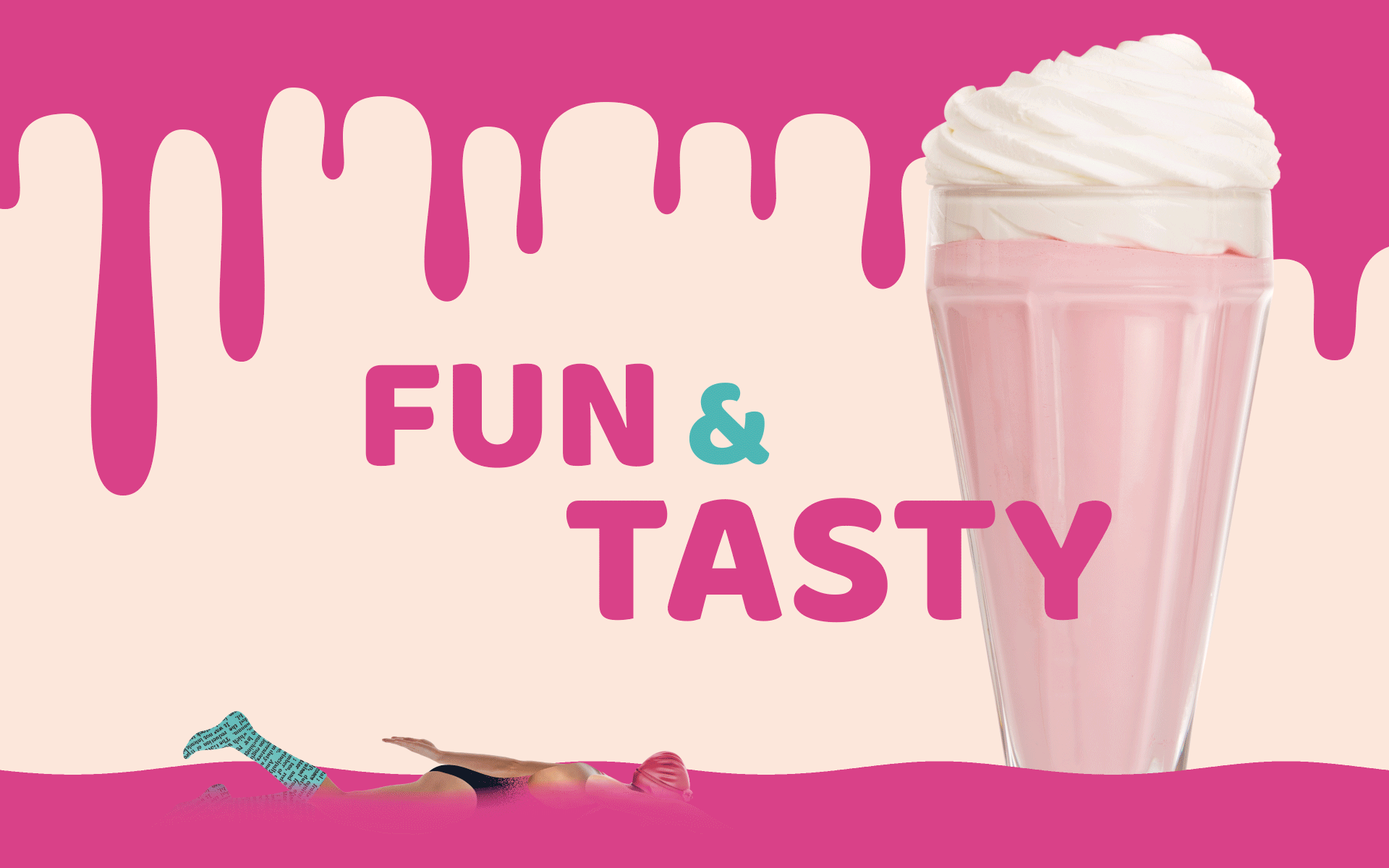
I came up with the idea of inviting our audience to take a dip in this refreshing, fun, and tasty world of digital marketing. The promise was that the audience would taste knowledge and have these feelings in each episode.
I came up with the idea of inviting our audience to take a dip in this refreshing, fun, and tasty world of digital marketing. The promise was that the audience would taste knowledge and have these feelings in each episode.


Naming, art direction
and main titles
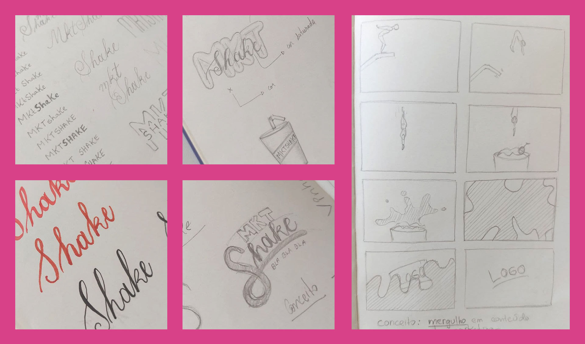
For the naming, after brainstorming and considering the concept previously presented, we chose "MKT Shake". "MKT" for the abbreviation of the word "marketing" and the word "shake" would bring the concept of these drops of knowledge and curiosities that we would bring to our audience. It was a fun part, with lots of funny names.
That time I was experimenting with collage and that was the perfect timing to implement that as the aesthetics of this visual identity and content as well.
I wanted to be fresh, tasty, fun, and playful. First I did some research and gathered images into a mood board that could show up those concepts, so I could start the sketching. I experimented with hand lettering and fluid elements. The main title was designed with a customized brush typeface and capital sans-serif letters. Some of them were created from scratch and others were modified so they worked together.
Full Credits
Production Company: RD Station
Audiovisual Coordination: Matheus Castilho
Art Direction: Rodrigo Kormann
Animation: Rodrigo Kormann
Audiovisual Coordination: Matheus Castilho
Art Direction: Rodrigo Kormann
Animation: Rodrigo Kormann